Submission form
Brief evaluations & overall evaluation.
Tuesday 28 May 2013
Wednesday 22 May 2013
Lookbook, digital
Below is a pdf of the final spreads for Stephs lookbook.
She is happy with the outcome and the design is ready to be
signed off and sent to print.
The lookbook layout concept came from the general weighting
of the logo, emphasising the garments that Steph wanted the focus
on, without compromising on how many items involved in
the lookbook. Some images show off the garments more than others.
There are some images that look incredible, but seem to show
off the model more than the clothing, which is not the focus that
the client wanted, so I devised a promotional piece of a6 postcards
for people who are interest in the collection to take away to
remember it by.
Monday 20 May 2013
setting up
Document set up- ergonomically focussed.
A printed version to see how it will handle. The pages
are sturdy and confident enough to stand alone as in my
sketches. The viewer only holds and reads one page at a
time to keep their focus and remove noise (information
on another page).
Large bottom margins in order for the reader to easily
hold the publication without their thumbs getting in the
way of the type. Large left margins in order for the
ringbind not to interfere with the type.
Labels:
BRIEF 0,
Design Context,
dp,
OUGD303
Experiential Design
Lasercutting- experiential design. Something a
little more tactile- not just a poster or publication.
Lasercutting went well. I chose to work with 3mm
mdf partially because of ease and partially because
of ease, and partially because of the size of the design
being cut out- there is just enough physical presence
that reflects the tone of the brand.
Below: pre- spray paint.
Above: post- spray paint.
Below: 3mm white acrylic. Came out surprisingly
successfully and clean. next step to experiment with
coloured acrylic for the 'communicate knowledge'
aspect of the logo to reflect the rest of the branding.
Labels:
Brief 3,
defero conscientia,
Make Your Mark,
OUGD303
Price listing
Type and Layout.
Above: The type is too wide and not compact
enough. It doesn't reflect the tight design that
goes behind Stephs garments.
Below: A few variations to see what exactly
will work, given the chunkier, more confident
outline of type I want to achieve.
Above: The type is too wide and not compact
enough. It doesn't reflect the tight design that
goes behind Stephs garments.
Below: A few variations to see what exactly
will work, given the chunkier, more confident
outline of type I want to achieve.
Because the '1.' is bold it is still clear when
closer to the garment description. The right
image is tighter and clearer.
Below: Kerning is a paint in the butthole.
But it is correct to do so. Specifically, the
prices below look terrible with automatic
kerning. Below, below - the type is sorted.
Layout and placement. Where do I typeset this information
in order to maintain congruency throughout?
Sunday 19 May 2013
Saturday 18 May 2013
Something different
Stockholm design studio PJADAD used tiny cubes and chunks of food to create this miniature landscape as a visual identity for the Swedish Atelier Food project and restaurant.
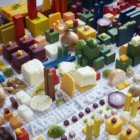
Towers of cheese, squares of beetroot, florets of broccoli and other edible items are laid out in a precise grid to create Still Life, which was designed byPJADAD as branding for Atelier Food, a Stockholm-based restaurant that runs workshops involving chefs, artists, designers, scientists and business developers.
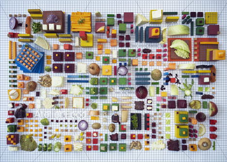
PJADAD, which stands for Petter Johansson Art Direction and Design, comprises art director Johansson, graphic designer Oskar Svensson and copywriter Anton Wigbrand.
Labels:
BRIEF 0,
context brief,
OUGD303
Stock options
Outside in: Mango yellow 130gsm uncoated; GFSmith
Sky blue 180gsm uncoated, textured; Mint green 80gsm
uncoated; Peach Champagne 80gsm uncoated.
The reason for this colour scheme is because it is an
optimistic and disgestible one. There are no offensive
colours, nothing too boystrous. They all work together
to create an engaging (mango yellow) yet accessible
publication (sky blue; mint green, peach champagne.)
Labels:
BRIEF 0,
Design Context,
dp,
OUGD303
Lasercutting
It was either vinyl or lasercutting wood for Steph's
exhibition space, with regards to her logo.
The point is to utilise the space, whilst staying true
to the collection and Stephs brand/identity.
exhibition space, with regards to her logo.
The point is to utilise the space, whilst staying true
to the collection and Stephs brand/identity.
The first space focuses moreso on Steph's work
as garments being worn, with a largescale image
of one of her garments that were worn for the photoshoot.
Below the clothing and image are her portfolio,
lookbooks and business cards.
The focus of the second space is to make it as
easy as possible for the viewer to see her clothing,
lookbook and collection all at once. The idea is
that rather than the first being focused on the
garments being worn, this space is showcasing
Steph as a brand and fashion designer.
The navy vinyl has managed to run out so
unfortunately I won't be able to experiment
with this medium. However, I plan to lasercut
3mm mdf, spray paint it white, then navy.
Above is the file for lasercutting the exhibition
space. Below is the thickness. It depicts the
presence the logo will have against a flat vinyl design.
Wednesday 15 May 2013
Subscribe to:
Posts (Atom)
